一、样式
1
| <h2 style="color:red;">红色</h2>
|
长宽单位:
- px:像素
- %:百分比
- in:英寸
- mm:毫米
- em:根据父级字体尺寸。如果字体是12pt,那么2em就是24pt。
- rem:根据根级别字体尺寸(html的字体尺寸)。
- vw:10vw = 视窗宽度的10%尺寸
- vh:10vh = 视窗宽度的10%尺寸
- vmin:10vmin = 视窗长宽中较小的一个的10%尺寸
- vmax:10vmax = 视窗长宽中较大的一个的10%尺寸
1
2
3
4
5
6
7
8
9
10
11
12
13
14
15
16
17
18
19
20
21
22
23
24
25
26
27
28
29
30
31
32
33
34
35
36
37
38
39
40
41
42
43
44
45
46
47
48
49
50
51
52
53
54
55
56
57
58
59
60
61
62
63
64
65
66
67
68
69
70
71
72
73
74
75
76
77
78
79
80
81
82
83
84
85
86
87
88
89
90
91
92
93
94
95
96
97
98
99
100
101
102
103
104
105
106
107
108
109
110
111
112
113
114
115
116
117
118
|
<link href="https://fonts.googleapis.com/css?family=Lobster" rel="stylesheet" type="text/css">
<style>
:root {
--penguin-skin: gray;
}
@media (max-width: 350px) {
:root {
--penguin-size: 200px;
--penguin-skin: black;
}
p {
font-size:20px;
}
}
h2 {
color:var(--penguin-skin, red);
display:flex;
flex-direction:row-reverse;
}
.customStyle {
--penguin-skin: white;
color:red;
font-size:16px;
font-family: Lobster,monospace;
}
.thick-green-border {
width:100px;
border-color: green!important;
border-width: 10px;
border-style: solid;
border-radius: 50%;
background-color:#000000;
opacity:0.5;
text-transform:uppercase;
font-weight:300;
line-height:25px;
box-shadow: 0 10px 20px rgba(0,0,0,0.19), 0 6px 6px rgba(0,0,0,0.23);
}
#hello {
background-color:silver;
background-color:hsl(0, 100%, 50%);
background:linear-gradient(35deg, #CCFFFF, #FFCCCC);
background:linear-gradient(35deg, #CCFFFF, #FFCCCC,#000000);
repeating-linear-gradient(
45deg,
yellow 0px,
yellow 40px,
black 40px,
black 80px
);
background:url("https://cdn-media-1.freecodecamp.org/imgr/MJAkxbh.png");
color: #fff;
padding: 20px;
margin: -20px;
margin:auto;
padding-top:40px;
padding-right:20px;
padding-bottom:20px;
padding-left:40px
margin-top: 40px;
margin-right: 20px;
margin-bottom: 20px;
margin-left: 40px;
padding:10px 20px 30px 40px;
padding-bottom:1.5em;
position:relative;
position:absolute;
position:fixed;
top:15px;
float:right;
z-index:2;
transform:scale(2);
transform: skewX(24deg);
}
[type='checkbox'] {
margin:10px 0px 15px 0px;
}
a:hover {
color:blue;
}
</style>
<h2 id="hello" >16px红色文本</h2>
<div class="thick-green-border"></div>
<img class="customStyle thick-green-border" scr="url">
|
样式优先级
带有!important的样式级别最高。
其次是标签的style属性中的样式。
然后 id样式 > class样式
style中class样式后定义的 > class前定义的
二、动画
1
2
3
4
5
6
7
8
9
10
11
12
13
14
15
16
17
18
19
20
21
22
23
24
25
26
27
28
29
30
31
32
33
34
35
36
37
38
39
40
41
42
43
44
45
46
47
48
| <style>
div {
height: 40px;
width: 70%;
background: black;
margin: 50px auto;
border-radius: 5px;
}
#rect {
animation-name:rainbow;
animation-duration:4s;
animation-fill-mode: forwards;
animation-iteration-count: 3;
animation-timing-function:ease-out;
animation-timing-function: cubic-bezier(0.25, 0.25, 0.75, 0.75);
}
@keyframes rainbow {
0% {
background-color:blue;
top: 0px;
opacity:1;
}
50% {
background-color:green;
top: 50px;
opacity:0.1;
}
100% {
background-color:yellow;
top: 0px;
opacity:1;
}
}
</style>
<div id="rect"></div>
|
三、Flex弹性盒子
父元素设置:display: flex;
justify-content
flex-start
flex-end
space-between
space-around
space-evenly
align-items(相当于crossAxisAlignment)
flex-start
flex-end
center
stretch:拉伸填满容器
baseline:文字基线对齐
flex-wrap
- nowrap:不换行
- wrap:从上往下、从左往右,自动换行
- wrap-reverse:反向,从下往上、从右往左,自动换行
flex-grow、flex-shrink
flex-grow相当于Expanded(flex:1)
flex-shrink相当于反的Expanded(flex:1)
flex-basis
设置尺寸。
flex-basis:20em;
flex-basis:auto;
flex:1 0 10px;
组合设置。
第一个数字代表flex-grow
第二个数字代表flex-shrink
第三个数字代表flex-basis
1
2
3
4
5
6
7
8
9
10
11
12
13
14
15
|
#box-1 {
background-color: dodgerblue;
flex:2 2 150px;
height: 200px;
}
#box-2 {
background-color: orangered;
flex:1 1 150px;
height: 200px;
}
|
align-self
不同的子元素,使用自己的align-items。
1
2
3
4
5
6
7
8
9
10
11
12
13
14
15
16
17
| #box-container {
display: flex;
height: 500px;
}
#box-1 {
background-color: dodgerblue;
align-self:center;
height: 200px;
width: 200px;
}
#box-2 {
background-color: orangered;
align-self:flex-end;
height: 200px;
width: 200px;
}
|
order:1;
order属性,可以强行调整html元素顺序。
默认先写的元素在前,后写的在后。
1
2
3
4
5
6
7
8
9
10
11
12
13
14
15
16
17
18
19
| <style>
#box-1 {
background-color: dodgerblue;
order:2;
height: 200px;
width: 200px;
}
#box-2 {
background-color: orangered;
order:1;
height: 200px;
width: 200px;
}
</style>
<div id="box-1"></div>
<div id="box-2"></div>
|
四、grid网格
自身设置display:grid;
grid-template-columns:100px 200px 300px; 3列,宽度分别是100px,200px,300px
grid-template-rows:50px 100px; 2行,高度分别是50px,100px。
grid-template-columns: auto 50px 10% 2fr 1fr; auto代表它自己的尺寸。%代表容器尺寸的百分比。fr代表占剩余空间的比例。
grid-column-gap:10px; 列的横向间距为10px。
grid-row-gap:5px; 行的竖向间距为5px。
grid-gap:5px 10px; 只有一个值,代表行列间距都这个值。
有2个值,前一个代表行的竖向间距。后一个代表列的横向间距。
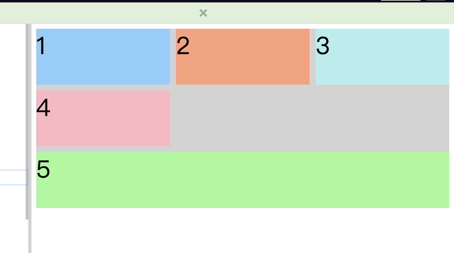
grid-column: 2 / 4; 代表这一个格子,占据2~3列。
grid-row:2 / 4; 代表这一个格子,占据2~3行。
grid-template-areas
1
2
3
4
5
| grid-template-areas:
/* 单元格分为4个区域,分别是header、advert、content、footer */
"header header header"
"advert content content"
"advert footer footer";
|
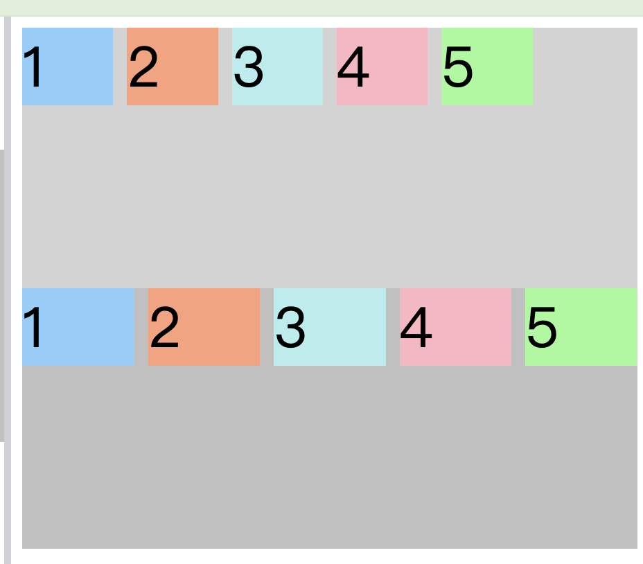
grid-template-areas
1
2
3
4
5
6
7
8
9
10
11
12
13
14
15
| .container {
grid-template-areas:
/* 单元格分为4个区域,分别是header、advert、content、footer */
"header header header"
"advert content content"
"footer footer footer";
}
.item5 {
background: PaleGreen;
/* 由于grid-template-areas中设置了footer占了第3行的3列,所以item5也会占据那么多 */
grid-area:footer;
/* 这4个数字分别代表,占据水平的第3线,垂直的第1线,水平的第4线,垂直的第4线之间 */
grid-area: 3/1/4/4;
}
|
1
2
3
4
5
6
7
8
9
10
11
12
13
14
15
16
17
18
19
20
|
@media (min-width: 300px){
.container{
grid-template-columns: auto 1fr;
grid-template-rows: auto 1fr auto;
grid-template-areas:
"advert header"
"advert content"
"advert footer";
}
}
@media (min-width: 400px){
.container{
grid-template-areas:
"header header"
"advert content"
"footer footer";
}
}
|
cell
- justify-self:center; start、center、end。子cell的对齐方式。
repeat方法
grid-template-columns:repeat(3,1fr) 20px;
repeat(2, 1fr 50px) 20px;
repeat的第一个数字代表重复多少次。
1fr 50px代表 第1个格子1fr,第2个格子50px, 第3个格子1fr,第4个格子50px….循化n遍。
最后一个20px代表最后一个格子的尺寸。
repeat(3, minmax(90px, 1fr));
minmax(90px, 1fr) 代表最小尺寸90px,最大尺寸1fr。
repeat(auto-fill, minmax(60px, 1fr));
auto-fill代表尽量放入由几个元素,会用空白位把改行放满,minmax(60px, 1fr)代表最小60px,最大1fr。
repeat(auto-fit, minmax(60px, 1fr));
auto-fit代表尽量放入由几个元素,不会用空白位把改行放满,minmax(60px, 1fr)代表最小60px,最大1fr。
上面是auto-fill,下面是auto-fit
范例
1
2
3
4
5
6
| /* 相对于其父元素的宽度自动调整大小,但不超过图片的原始大小。 */
#image {
margin: auto;
max-height: 100%;
max-width: 100%;
}
|